Guest Post: Reducing Waiting in Mass Transit

Prof. Howard Weiss shares his insights with our readers monthly.

A recent article in the Philadelphia Inquirer noted that SEPTA, the transit authority for Philadelphia and its suburbs, “is shopping for a contractor to build a new fare collection system with more convenient payment options.”

Work on the current SEPTA fare system began in 2011, and like many projects, the system was delivered two years late in 2016 and at nearly double its original $122 million budget. While the fare system is only 7 years old, it was almost obsolete when it was delivered because riders could not purchase their tickets or fare cards from home as they can for transit systems in several cities. Of course, purchasing at home or by app saves time when traveling by not having to wait in line at a kiosk to buy a ticket or put money on a fare card. It also reduces the probability of missing a train because you are stuck in line.

Several cities go a step further to improve transit times. You do not even need to go through a turnstile or wait for a bus driver to check your ticket. These cities use an honor system that relies on riders to purchase their tickets. This reduces boarding times and lines for busses and waiting times on the subways. Also, passengers can board busses using any door not just the front door which reduces the boarding time. There are controllers who may check tickets and if the rider does not have one the rider is fined – for example, $60 in Hamburg, Germany, $150 in Copenhagen, or $250 in Los Angeles.

Roads, Bridges and Tunnels
Thirty-five states have toll roads, bridges or tunnels. Many of these have been allowing drivers to use the web to upload money to their passes since their inception. In addition, some toll areas have express lanes for EZ pass drivers making collection times faster than driving through a toll booth. Some roadways have implemented toll by plate where rather than staffing a toll booth a picture is taken of a license plate and a bill is sent to the driver by mail if the car did not have a transponder for the system.

Roughly half of the toll collection locations in the U.S. collect tolls in only one direction rather than both directions. Obviously, this reduces waiting time in the toll-less direction.

Classroom discussion questions:
1. What is the downside to the toll collection agency using one-way tolling?

2. What are the disadvantages of operating a toll by plate system?


Guest Post: Product/Service Lifecycle– Landlines, Operators and Cellphones

Prof. Howard Weiss is providing Guest Posts while I am travelling abroad.

Recently Bloomberg reported that AT&T will end its operator service in 21 states, meaning that 3 million customers with digital landlines can’t dial 0 and get directory assistance. At the conclusion of World War I, there were roughly 180,000 operators employed by telecommunication companies. The number peaked to 350,000 in the 1950s but is now down to 550.

The decline in the need for operators is due to two obvious factors:.
1) There has been a steep increase in the number of households that have replaced landlines with cellphones. In 2003, 3% of adults had wireless only service; in 2008, 19% had wireless only, whereas as of June 2022, 71% of adults had wireless only service. Unsurprisingly, the percentage usage of wireless only service is related to age in that 89% of persons 25-29 years old do not have landlines whereas only 45% of persons aged 65 and older do not have only landlines. As of 2017, only 10% of the 455 million telephone numbers in the U.S. were for landlines.

2) There has been an increase in the use of the internet to find phone numbers.

Clearly, landlines and operators are both in the Decline stage of the life cycle that is displayed in Figure 5.2 in your Heizer/Render/Munson textbook while cell phones are somewhere between the Growth stage and Early Maturity stage Other products and services that are related to landlines are showing similar declines.

Answering Machines
The first commercially viable answering machine was developed in 1949. Answering machines became more widely used after the restructuring of AT&T in 1984, which was when the machines became affordable and sales reached one million units per year in the U.S.

Voicemail
The main difference between answering machines and voice mail is that messages on answering machines are stored locally whereas voicemail messages are stored in a different location, such as the cloud. Many businesses no longer use voicemail but instead rely on contact forms and emails. In addition, for many consumers, contact via the web is preferred over phone calls.

Classroom discussion questions:
1. What other products are in a growth stage due to the increase in cellphone usage?
2. What professions are in a growth stage due to the increase in cellphone usage?

Guest Post: Production of TABASCO® Sauce

Prof. Howard Weiss, who developed the Excel OM and POM software free to our readers, provides his insights on a monthly basis.

Everyone is familiar with the iconic bottle of Tabasco. The sauce was first developed in 1868 by Edmund McIlhenny and while there are currently hundreds of hot sauces available Tabasco was the first. Production of Tabasco exhibits several of the aspects of operations management that are in your Heizer/Render/Munson textbook.

Raw Materials (in Ch. 1): Tabasco sauce is made from only three raw materials – tabasco peppers, salt and vinegar. The peppers
were originally from …

Location (in Ch. 8): … Avery Island, a small area surrounded by bayous in Louisiana, which has the perfect climate and soil, for growing the peppers. Now the peppers also come from other places in Louisiana, Mexico, South America and Africa.

Process (in Ch. 7): It takes five years to go from peppers to Tabasco sauce. The peppers are picked by hand, are mashed and mixed with salt, also from Avery Island, and then aged for over 3 years in …

Supply Chain for Equipment (in Ch. 11): … decommissioned white oak bourbon barrels sourced from different distilleries around the country with all traces of alcohol removed.

Quality Control (in Ch. 6): Each batch of tabasco goes to a lab and also is inspected by a McIlhenny family member before being mixed with vinegar for 28 days to become Tabasco Sauce. In addition, the barrels undergo a quality control inspection before being reused.

Byproduct (in Supp. 5): When a barrel can’t be reused, the wood is broken down into wood chips and the barrel’s stainless-steel hoops are reused.

Capacity (in Supp. 7): Approximately 20,000 to 22,000 barrels are put into production each year. Each barrel contains enough sauce for 10,000 of the 2 ounce bottles shown above.

Distribution (in Ch. 11): It is then bottled and labelled in multiple different languages and shipped to nearly 200 countries around the world. It was the favorite hot sauce of the late Queen Elizabeth.

Reliability (in Ch. 17): After Hurricane Rita, the family constructed a 17-foot high levee around the low side of the factory and also invested in back-up generators.

Classroom discussion questions:
1. What other products have climate as a main factor in facility location?
2. What other products get reused in way different from their original use?


Guest Post: Peanuts, Peanut Butter, and Byproducts

Dr. Howard Weiss shares his thoughts with our readers monthly. Howard is a retired Temple U. professor.

Skippy Foods is recalling thousands of pounds of Skippy peanut butter because of stainless steel fragments possibly contaminating “a limited number of jars.” Clearly, the quality control department did not find the fragments in the jars that they inspected. While this is unfortunate, your Statistical Process Control chapter (Supplement 6) indicates that this can happen and describes the failure as a Type II error where a bad lot passes inspection but is accepted. 

Of course, placing the peanut butter in jars is only one step in the peanut butter supply chain. The supply chain for peanut butter is very similar to the supply chain for soft drinks described in Figure 1.2 of your Heizer/Render/Munson textbook.


Farmer: Peanuts are planted in spring, 4 to 5 months later are delivered to warehouses for cleaning, shelled, graded for size, shipped to peanut butter manufacturers

Producer: Peanuts are dry roasted, removed from heat, skins are removed. Nuts are screened and inspected. Peanuts are ground and converted to peanut butter 

Packaging: Peanut butter is packed

Distribution: Peanut butter goes to distributor

Sales: Peanut butter goes to retail outlets

Quality control is a part of each of the steps listed above. The peanut butter must meet standards maintained by the U.S. Department of Agriculture and the Food and Drug Administration and the peanut butter is graded by the USDA as Grade A or Fancy, Grade B or Choice or substandard. The grade is a weighted average of color, consistency, absence of defects and flavor and aromas

As is the case with many production operations, the processes yield byproducts. While peanuts are grown mainly as food or for their oil, after harvesting there are leaves, stalks, vines and pods that remain in the field. This residue has high nutritional value and is used as animal feed for assorted livestock. The peanut shells that are a byproduct of the shelling plant are used in the manufacturing of several products and also can be used as compost, mulch, kitty litter or used in fireplaces. Peanut shells can also be used in place of salt on icy sidewalks. And, of course, real peanut shells can be used as packing material in lieu of styrofoam peanut shells.

Classroom Discussion Questions: 

  1. Cite another product that produces byproducts during production.
  2. What other nuts are commonly turned into nut butter? 


Guest Post: Project Management in the Mississippi River Wetlands Reclamation

This month, Prof. Howard Weiss discusses project planning. Howard is a recently retired Temple U. colleague.

A massive coastal restoration project in Louisiana could test whether new wetlands can be created
faster than they’re disappearing under waves and rising seas according to Scientific American (Mar 11,
2021).
The goal is to deposit land-building sediment to restore much of the 2000 square miles of marsh along the Louisiana coastline that has already been lost and the forecasted 4,200 additional square miles that will be lost over the next 50 years if no action is taken.

This $1.5 billion project was first proposed over 7 years ago and is in the second step of Project Planning, “Define the Project,” as indicated in Figure 3.1 of your Heizer/Render/Munson textbook. The goals have already been set
 Time: Over one year, beginning in late 2022
 Cost: $1.5 billion – $2 billion
 Performance: Redirect more than 12% of the Mississippi River’s flow into a marsh over the next 50 years. The capacity will be 75,000 cubic feet per second.

The project definition stage is very complex as seen in the following steps that must be described for
this project:
 Planning process including general description of implementation
 Analysis tools used including cost/benefit analysis, benchmarking
 Stakeholders involved in planning
 Authorization for goals
 External operating environment factors and effect on plan
 Formulation of objectives variables
 Building strategies including capacity, organizational structure, resources needed, timeline
 Accountability – identify performance indicators for each objective
 Fiscal impact of plan including operating budget and capital outlay budget

This is not the first coastal restoration project. The projects are of two types – restoration projects and
risk reduction projects. Louisiana’s Coastal Protection and Restoration Authority (CRPA) has begun over
150 projects in 20 parishes (counties) and over 60 miles of barrier islands. Of course, as we have seen in Chapter 8, “Location Strategies,” attitudes and pollution are important considerations. Project opponents argue that
the fish industry would be greatly affected because the balance of fresh and sea water would change.

Guest Post: Smoking– Forecasting and Product Life Cycle

Today’s Guest Post comes from Prof. Howard Weiss, the developer of the Excel OM and POM software that comes free with our text.

Forecasting: For the past 40 years, cigarette smoking has been declining at a rate of 3% to 4%. The
drop can be seen in the figure below and it clearly is following an almost straight line, which makes
forecasting very easy using the trend projection method discussed in Chapter 4.

Some of the more recent decline can be attributed to the introduction of e-cigarettes and vapes. However, smoking is on the rise again during this current pandemic which means that time-series forecasting methods, which rely on past data, would not be very useful for forecasting sales of cigarettes in the foreseeable future.

Product Life Cycle: Below is a figure that displays sales of cigarettes from 1900 to 2015 for 8 different countries on 3 different continents.

What is interesting about the figure is that while smoking started and peaked at different years, for all of
these countries, the pattern is identical for each country to Figure 2.5 in the text, which displays the 4 phases of the life cycle – Introduction, Growth, Maturity, and Decline. It is also interesting to note that the life cycle for cigarettes has been over 100 years.

Classroom Discussion Questions:

  1. Cite another product or service with a life cycle as long as a century.
  2. Do you think you can trust all of the data in the figure?


Guest Post: Lobsters, Shrinkage, Process, and the Supply Chain

Our Guest Post today comes from Howard Weiss, Professor of Operations Management Emeritus at Temple University.

In Chapter 12’s discussion of inventory, your Heizer/Render/Munson textbook discusses shrinkage and notes that shrinkage is “inventory that is unaccounted for between receipt and time of sale, and occurs due to damage and theft as well as sloppy paperwork.” Shrinkage does not have to occur at any one particular facility but can occur at multiple points throughout the supply chain. A prime example of this is what happens with lobsters.

The usual steps in getting a live lobster from Maine to a restaurant are:
 Catch the lobster in a lobster trap
 Transfer the lobster to the to the ship’s storage well
 Transport the lobster to storage at the wharf
 Truck the lobsters to a dealer
 Transport the lobster to a restaurant
Shrinkage occurs because lobsters die as they move through the supply chain. Each 1% in shrinkage equates to a $5,000,000 loss in sales.

The goal of Process Analysis, as explained in Chapter 7, is to “continuously improve the process.” Currently, researchers at the University of Maine are doing just that by studying the above supply chain in order to try to reduce the time involved in any of the steps and determine which steps would give the greatest benefit if the time is reduced.

Of course, not all lobsters are shipped live and follow the steps above. Some lobsters are euthanized then sent to a processing plant where tails are separated from the rest of the lobster which is processed to produce raw lobster meat. In addition, during the pandemic some fisherman have resorted to selling the lobsters directly to local restaurants or consumers.

Classroom discussion questions:

  1. What factors would be important when shipping live lobsters?
  2. What Ch.7 process analysis tool would be most useful for improving the process?

Guest Post: Waiting Lines and the Coronavirus

Our Guest Post today comes from Howard Weiss, Professor of Operations Management Emeritus at Temple University.

A couple of thoughts have come to my mind recently with respect to the coronavirus.

As more citizens become infected with a virus, fewer citizens are available to become infected. This is identical in principle to the arrival rate in a finite population waiting line system. Consider, Example D7 from your Heizer/Render/Munson textbook. There are 5 printers that each break down at the rate of .05 per hour. Thus, if all five computers are working, the system arrival rate is 5*.05=.25 while if all 5 are broken down the system arrival rate is 0. Over time, the arrival rate changes depending on the number of printers that are working and we can compute the weighted average arrival rate, which we term the effective arrival rate. The Excel worksheet for this example, available on MyOMLab, computes the effective arrival rate as .218 printers per hour. This effective arrival rate is similar to the effective reproductive number that epidemiologists use for viruses.

Data Results
Arrival rate (l) per customer 0.05 Average server utilization(r) 0.436048
Service rate (m) 0.5 Average number of customers in the queue(Lq) 0.203474
Number of servers 1 Average number of customers in the system(Ls) 0.639522
Population size (N) 5 Average waiting time in the queue(Wq) 0.933264
Average time in the system(Ws) 2.933264
Probability (% of time) system is empty (P0) 0.563952
Effective arrival rate 0.218024


An interesting graphic related to the virus spread is at this Washington Post web site.

Observation: I recently had the opportunity to attend a concert at the Amalie Arena in Tampa. At intermission, the men’s room had a long line. This is not unusual. However, the line was not for the urinals or stalls but rather for the sinks. This was unusual. The design of the bathrooms was clearly for normal use rather than for a situation like the one we currently have with increased demand for handwashing. I was wondering what an arena might do to handle the increased sink demand.

Guest Post: Being an Understanding Professor Under Extreme Circumstances

Our Guest Post today comes from Howard Weiss, Professor of Operations Management Emeritus at Temple University.

Nearly 50 years ago there was a nationwide student strike due to the shooting deaths of 4 students at Kent State University, with over 450 campuses shut down. The similarities between May, 1970 and today are striking. I was a student in 1970 and what I remember most is that all of my professors understood the circumstances and tried to accommodate students while maintaining as much academic rigor as possible.

The transition today from face-to-face classes to online classes is a difficult process. In addition, many students have been displaced and may not have reliable high-speed internet access at their new location. Some will not be familiar with web conferencing technology such as WebEx or Zoom.

Assignments An obvious way to reduce student apprehension is to extend the deadline on written assignments.  Students can submit Word documents through email and you can grade them using Word’s Review tab. If you have been collecting homework problems in class from your students then it is an easy change to have MyOMLab grade the homework. (Pearson has just made the MyOMLab available free for 90 days to all Heizer/Render/Munson adopters). If you usually have students solve problems by hand, consider allowing them to use the text’s free problem-solving software such as Excel OM or POM.

Exams If you have been giving exams that you have written yourself, consider instead using MyLab. The distribution of the exam would be simple and the randomness in the question order and the random numbers in the questions help mitigate students cheating.

Classroom discussions are much different than discussions using a Discussion Board. It is very easy for student replies to overrun the Discussion Board and for students to ignore other students’ responses. Control of the responses is of extreme importance. In addition, students may expect you to be monitoring the Discussion Board 24/7.

Lessons It would be useful for every professor to develop and teach an online course in order to be prepared in the event of any situation, ranging from a minor interruption to the current emergency. The main lesson though is that students and faculty all need to be understanding and compassionate during this troubling time.

OM in the News: The Wine Supply Chain

Combined with a decreased demand for wine, drinkers can expect to get better value for every drop they drink this year. The cheaper prices may even last up to 3 years. Vineyards in Northern California began planting thousands of acres of new vines in 2016, and with more efficient harvesting methods, it has led to more bountiful harvests of grapes. Having more grapes to make wine sounds good, but if there’s not enough demand to support increased production, the surplus grapes go to waste.

“Since it takes up to 5 years to bring wine to market from the initial planning stages of planting a vineyard, it makes hitting future demand very complicated. In this case, we overshot demand.” said an industry expert. Wine consumption has dropped for the first time in 25 years, with more Americans turning to liquor and ready-to-drink cocktails. “Today, the wine supply chain is stuffed,” says the newest State of the Wine Industry Report. “This oversupply, coupled with eroding consumer demand, can only lead to discounting of finished wine, bulk wine and grapes.”
Prof. Howard Weiss, from Temple U., who sent us this link, has these 3 OM takes on the article:
1. Forecasting. The forecasts did not anticipate the change in the type of alcohol wine drinkers would turn to.
2. Efficiency. We usually think of improved efficiency as a positive, but in this case it led to oversupply.
3. Supply chain. The vineyards have a 5 year lead time in their supply chain between vineyard planning and creating the wine.
Classroom discussion questions:
1. How does this supply chain differ from that in other industries?
2.  Why is forecasting so difficult?

Guest Post: Odd Quantity Discounts

Our Guest Post today comes from Howard Weiss, who is Professor of Operations Management at Temple University. 

Several of the models in OM assume proportionality, so when I get to break-even analysis (Supp.7), I explain that one of the assumptions is that the cost/unit for each unit is identical and the revenue/unit is identical for each unit. I like to ask the students to give me examples where it would not be the case that revenue is directly proportional to the number of units sold. The bulk of the examples the students cite are due to quantity discounts. I explain that our basic breakeven, transportation and LP models (Modules C and B) do not allow for quantity discounts but that when examining inventory (Chapter 12) we will see models that include quantity discounts.
What I like to bring into class though, for amusement, are odd instances of quantity “discounts”. Very recently I was in a Houligan’s restaurant and saw the cost per wing was more for 10 wings than for 6 wings. Jack’s Restaurant and Bar in NYC currently has what I think is an interesting pricing option for Tapas when comparing 3, 4, and 5 tapas. Lancer’s is a very nice diner near Philadelphia. It has what I think is an interesting pricing strategy when you compare the price of 12 oz. for two products with the same cost for 8 oz. glasses.

I usually delay the next example until I teach LP. Stroehmann’s bread is interesting. The picture below is from a loaf of bread from a few years back. Stroehman’s used to report nutrition for both 1 and 2 slices. The newer packages only report the calories in one slice. Two slices of bread have 110 calories whereas one slice has 50 calories. Of course, the calories should be proportional.

Best Buy once ran a sale where buying 100 DVDs was less expensive than buying 50 DVDs. Not less expensive per DVD but rather less expensive in total cost! I always encourage my students to be alert for these odd quantity discounts.


Guest Post: A Breakeven Analysis Using Real Data

Our Guest Post today comes from Howard Weiss, who is Professor of Operations Management at Temple University. Howard has developed both POM for Windows and Excel OM for our text.

I like to direct my students to real data whenever possible in my Operations Management course. The Philadelphia Inquirer (http://www.philly.com/philly/blogs/inq-phillydeals/grateford-phoenix-prison-400-million-new-20170915.html) has an article about a new prison, Phoenix, that is being built in Pennsylvania to replace the old prison, Graterford. Phoenix is expected to open in July, 2018. The article gives data that makes it very easy to formulate a break-even example for the students.

According to the article, Phoenix cost $400 million to build, will cost $90 per day to house an inmate and will have 4055 beds. Currently at Graterford it costs $123 per day per inmate.

I have asked my students to determine the following:
1. What is the total savings per year assuming the prison operates at 100% capacity?
2. Why is this different from the $48 million dollars reported in the article? Assume the costs given above are correct.
3. How many years will it take until the Phoenix project breaks even based on the $48 million reported in the article?

I expect my students to:
1. compute the savings per inmate per day ($33); the savings per inmate per year ($12,045); the total savings per year? $48,842,475
2. realize that the prison does not operate at full capacity and hopefully to report that the effective capacity is 98%.
3. compute the break-even point in years (8.33 years).


Guest Post: Productivity, Forecasting and Excel with Real Data

Our Guest Post today comes from Howard Weiss, who is Professor of Operations Management at Temple University. Howard has developed both POM for Windows and Excel OM for our text.

I often search the web for real data that I can use for forecasting, and just came across data from Lowes 10 – Year Financial Information report that can be used for both productivity and forecasting.

The report has 5 sections, with 2 that are of major interest to OM. The 1st is titled “Stores and People” and lists the productivity inputs and outputs of: (1)Number of stores; (2)Selling square feet; (3)Number of employees; (4)Total customer transactions; (5)Average ticket.

The next section includes the net sales. I have the students perform several exercises using these data. Here are 5 years of past data.

The Exercises

Exercise 1 – Data integrity:  For each of the years the net sales should be equal to the anticipated net sales (my definition) given by the average ticket multiplied by the number of transactions. Of course, the anticipated and reported net sales are not exactly equal. I ask the students to compute the percentage difference between the reported net sales and the anticipated net sales and also to determine the MAPE differences.

Exercise 2 – Productivity:  For each year, there are 3 productivity measures that can be computed comparing net sales to number of stores, selling square feet and number of employees. Unfortunately, there are no multipliers available to compute the multifactor productivity measures for the 10 years.

Exercise 3 – Productivity change: For all years except the first, I ask the students to compute the productivity change for each of the 3 productivity measures. There is one small issue the students need to recognize. The data is given as most recent first.

Exercise 4 –Graph in Excel: I ask the students to graph the 3 sets of productivity measures. If the students create scatter graphs using the dates in row 3 and the productivity measures that they create in a row below the data then the graph will be fine. If the students create a line graph using only the computed productivity measures then the graph will run backwards. That is, the time axis will be backwards. This is important for the final exercise.

Exercise 5 – Regression/Trend Line – I ask the students to draw a regression/trend line for each of the three measures. I have shown my students that right-clicking on the graph is the easiest way to create the line. I also ask the students to find the three average productivity changes based on the slope of the line in each of the three graphs.

The students very much appreciate applying Productivity to real data, using data that has more than 2 periods and having the opportunity to work in Excel, especially with the graphing capability and regression capability within the graph option.

Guest Post: MyOMLab and Partial Credit

howardweiss2Our Guest Post today comes from Howard Weiss, who is Professor of Operations Management at Temple University. Howard has developed both POM for Windows and Excel OM for our text.

I have used MyOMLab with the Heizer/Render/Munson text for over 6 years now. One option on assignments in MyOMLab is to “Allow partial credit on questions with multiple parts.”  In other words, a student does not need to get every part correct on a question to receive credit. This is only one aspect of partial credit and because I use MyOMLab for exams I need to allow for other types of partial credit.

For example, I commonly see students making these mistakes:  Forgetting the initial inventory in aggregate planning;  Maximizing instead of minimizing in LP;  Entering the service time instead of the service rate in waiting lines;  Not converting one time unit to another in line balancing;  Not converting months to years in inventory; Not multiplying by the cost per unit in layout.

For some of these mistakes, all answers would be incorrect and MyOMLab would give the students a zero for each problem. When I used to grade exams by hand, I would typically identify the mistake and give the student partial credit on the problem.

I now tell the students that they must save all of their work on the problem, which in my case is an Excel file. I encourage the students to review their exam results and to send me an email if they think they deserve partial credit on the problem. They must include their original Excel file with the incorrect work so that I can see that it matches the answer they entered into MyOMLab, an explanation of the mistake that they made, and the correct way to solve the problem. I typically give half credit on the part of the question for students who successfully do this. Many of my students take advantage of this option. They, of course, want the exam points and, I, of course, want them to learn from reviewing the exam.

Guest Post: Using Excel OM on a Tablet

HowardWeiss2Howard Weiss is Professor of Operations Management at Temple University. He has developed both POM for Windows and Excel OM for our text.

It is now very easy to run Excel OM on an iPad or Nexus. This is not due to changes in Excel OM but rather due to a free app that is available for tablets. The app is OnLive Desktop and can be found at the iTunes App Store or the Google Play Store. The app runs Windows 7 on your tablet and includes Microsoft Office 2010. Unfortunately, the internet is not available with the free version.  OnLive interfaces with your files through an account on the OnLive cloud.

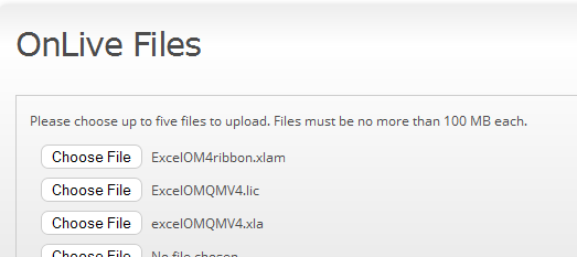
To setup OnLive you simply need to : (1) Install OnLive Desktop on your tablet; (2) Create a free account at desktop.onlive.com; and (3) Upload ExcelOM (3 files) to your OnLive cloud account as shown below.

Excel OM1

To run Excel OM on your tablet you: (1) Open OnLive Desktop on your tablet and sign in; (2) Open Excel; and (3) Go to File and Open ExcelOMQMv4.xla

You can save your Excel OM problem files to your account at OnLive desktop and then access them from your computer.

Please note the following:

  • OnLive desktop’s Excel does not include Excel’s Solver so you cannot run linear programs, transportation models or the project management crashing model.
  • Some of Excel OM’s tools, such as visiting the Pearson web site are not available since the internet is not available.
  • Your current version and build of Excel OM will work but Excel OM has been updated to better interface with OnLive so you should download the latest build from the Excel OM support page at prenhall.com/weiss.

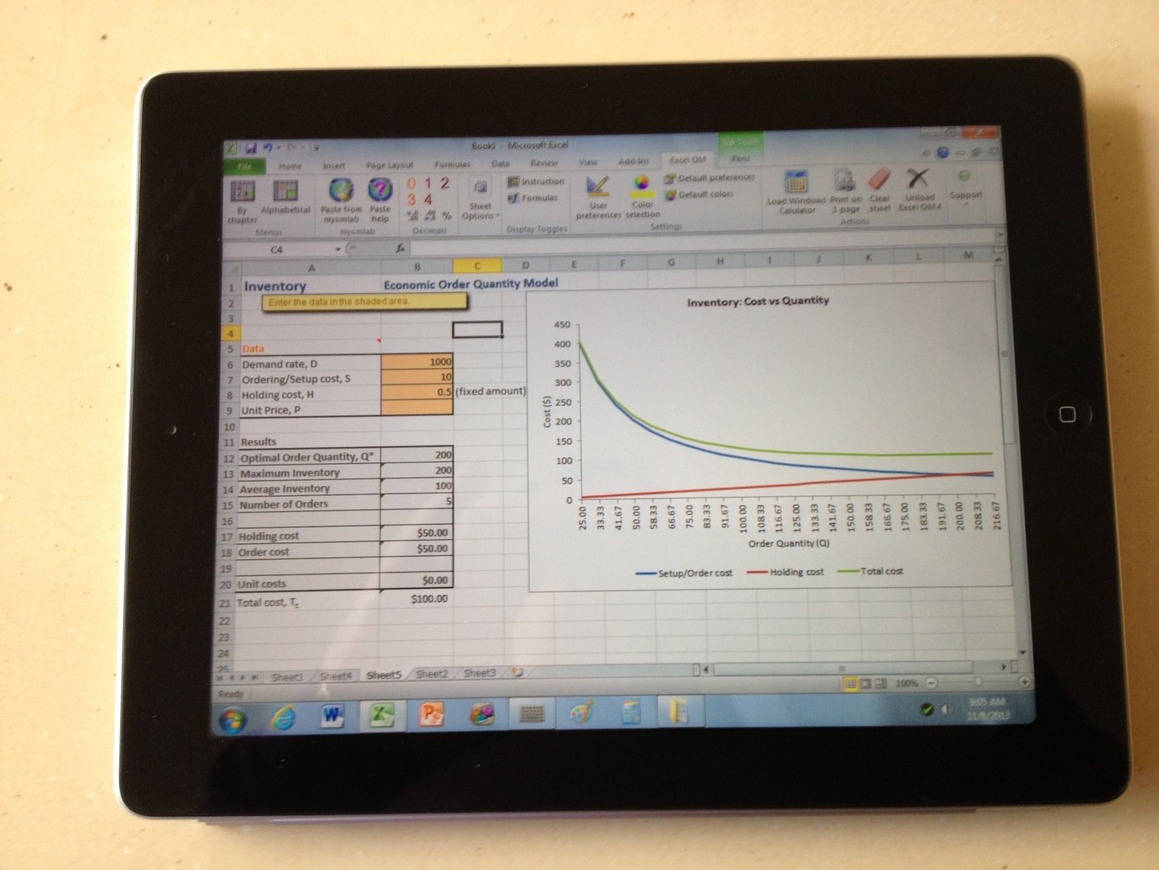
Below is a picture of Inventory Example 3 from Heizer/Render OM 11e, using Excel OM on an iPad

excelom2