OM in the News: Lowe’s Turns to Satellites to Forecast Customers

lowesForget Amazon’s package-toting drones—the future of retail may lie in satellites. That’s how Lowe’s is catching up to Home Depot in the hunt for customers. Lowe’s, writes BusinessWeek (Feb. 26, 2014), says that “it has been gauging traffic at its almost 1,900 stores from space, scanning satellite images of its parking lots to find out how many shoppers it can expect at every hour of every day.” It has also started syncing its parking lot observations with actual transaction counts to see how many people drove away without making a purchase.

The space snooping is a great way for Lowe’s to manage its workforce, scheduling surges in floor staff when parking spaces are about to become hard to come by. Evidence shows the satellites are helping move the needle for Lowe’s. The fourth-quarter close rate—the share of shoppers who bought something—improved by almost 1%, and total sales per hour of labor increased by 2%. The company’s profit in the recent quarter increased 6.3%, while sales ticked up 3.9%.

Anyone who has every wandered through a hardware superstore looking for an odd screwdriver or a particular kind of sandpaper understands how critical staffing is for Lowe’s. Cornering an aproned employee can seem more challenging than fulfilling the project. And there are few greater frustrations in retail than standing by with a simple question while another customer solicits a protracted product review.

Lowe’s and Home Depot more or less sell the same products at the same prices in the same places. Assuming their supply chains and marketing strategies are in sync, their market shares ride almost entirely on service. From that perspective, being able to have more employees around when more customers need help is success–and not paying them to sit around in the store when shoppers are sparse helps, too.

Classroom discussion questions:

1. What other technologies can chains like Lowe’s use to increase productivity and sales?

2. Why is service such an important factor at Home Depot and Lowe’s?

OM in the News: Using Regression Analysis to Forecast Olympic Medals

olympicsHow many medals will the U.S. walk away with at this year’s Winter Olympics? What about perennial runner-up China? Two brothers, writes Fast Company (Feb. 7, 2014), have the answers. Since the 2010 Winter games, the two collected more than 30 datasets and ran regression after regression until they found a model that accurately matched the past two Winter Olympics.  According to Tim and Dan Graettingers’ model, the U.S. will walk away once more with the most overall medals, though it won’t come close to last Olympic’s record-setting 37 individual awards.  China, which only won 11 medals in the last Winter Games, is set to double its haul.

For the final model, the Graettingers found that only four variables consistently predicted a country’s medal count in the Olympics (with an R-squared of .585):

Geographic area – Their best guess is that it may reflect the nation’s population and/or the genetic diversity within the nation and/or the presence of mountain ranges on which to ski and snowboard.  Also, it does separate the relatively larger nations of the world from the many small (geographically and population-wise) island nations in the Caribbean and the Pacific.

GDP per capita –  It seems to confirm the hunch that nations whose people are affluent can afford to spend time pursuing excellence in sports, while poorer nations cannot.

Value of Exports – This measure of a nation’s total economic power seems to complement per capita GDP.

Latitude of Nation’s Capital –  The further your country is from the equator, the more snow and ice you’ll have – and the more medals you’ll win at sports contested on snow and ice.

By the way, no nation from Africa, South America, or the Middle East has ever won a medal at the Winter Olympic Games.  No nation from the Caribbean has either, despite the worthy efforts of the Jamaican bobsled team!

Classroom discussion questions:

1. What are the strengths and weaknesses of this model?

2. How accurate were the brother’s forecasts when the final 2014 tally was completed at the end of the games? (Here is a link to their country by country forecasts).

OM in the News: Forecasting for the Fashion Industry

fashionIn the fashion business, faux pas can be costly. In order to hem back the risk, writes The Wall Street Journal (Sept. 9, 2013), some retailers are increasingly turning to trend forecasting and analytics (the topic of Chapter 4). For an average annual fee of $7,000-$15,000, customers get access to forecasts of fashion trends and data offering ideas for colors, fabrics and cuts. Fashion companies use the data to plan their latest collection or show.

“Fashion forecasters have always been used but they’re more accessible now because of the technology,” says a Marks & Spencer exec. “They are important, not always to lead but to re-evaluate and help confirm you’re on the right track.”

Forecasters claim to save their clients travel expenses, the cost of freelancers paid to photograph trendy people, and time spent trawling the vast cache of fashion data on the Internet. “We can’t get rid of risk but we can mitigate risk,” says the CEO of the forecasting firm Stylesight.

“Forecasters take the information and package it in a way that speaks the language of the retailers and manufacturers. Then it’s our job to decide what makes sense for our business; we have to filter it again,” says Kohl’s VP.  “Fashion moves so quickly. Companies like Stylesight, which are updated every day, are really useful in order to make sure we have the right information. They offer us an industry eye on all of the information, broken down by print, color and classification like sweaters of woven tops.”

Retailers say the information forecasters provide has become an important part of how they tap consumers, who spend less, shop online more and demand the latest outfits in increasingly tight time frames.

Discussion questions:

1. Why do large retailers like Macy’s and Kohl’s need forecasts of fashion demands?

2. What forecasting techniques discussed in Chapter 4 can be applied to this problem?

Guest Post: Beat the Instructor–A Great Classroom Forecasting Exercise

brent sniderOur Guest Post today comes from Brent Snider, who is an award winning instructor of Operations Management at the University of Calgary’s Haskayne School of Business.

Forecasting is covered late in the term in our required undergrad course, which may contribute to student apathy towards the topic.  Beat the Instructor was developed after recognizing that there were no spreadsheet-based experiential introductory exercises that have been shown to build significant student interest in learning forecasting techniques.

Most forecasting exercises tend to be highly technical and or intended to be used after forecasting techniques have already been introduced in lectures.  Beat the Instructor is an in-class game that enables student groups to compete against their instructor in an introductory time-series forecasting exercise, even before any lecture content has been covered.  In addition to starting the forecasting topic positively via a 30 minute hands-on experiential learning exercise, the game has proven to build strong student interest in learning the forecasting techniques that are covered later in the lecture.

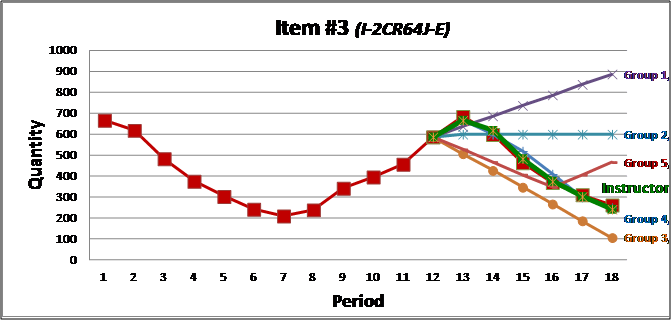
beat the instructor graphStudent groups are provided a spreadsheet with historical demand for 12 previous periods for 4 separate items.  Each of the 4 items represents one of the classical demand patterns of trend, cycles, seasonality, and random variations.  The students are then asked to predict demand for the next 6 periods for each item, and submit their forecast to the instructor.  In addition to competing amongst themselves, student groups are challenged to outperform the instructor’s forecast (who also predicts demand using the techniques that will be subsequently covered).  Each group’s forecast is graphed, in addition to the instructor’s, creating anticipation for the actual demand pattern.  After actual demand is randomly generated (and revealed on the graph), each group’s forecast error is calculated and ranked.  Typically the instructor outperforms most if not all groups, generating student interest in learning the techniques that can answer their often posed question: “How did you forecast so well?”

Guest Post: A Great Classroom Forecasting Exercise

steve harrodDr. Steven Harrod is Assistant Professor of Operations Management at the University of Dayton and can be reached at steven.harrod@udayton.edu. This is his 3rd guest post for our OM blog.

This large data set, Excel based, forecasting exercise is suitable for an hour lecture, after students have learned basic time series forecast methods in Chapter 4 of the Heizer/Render text. It gives a “real world” experience, and provides an excellent opportunity to visual the significance of error statistics in more detail. Here are instructions:

  1. Distribute the data (here is the link), but do not reveal its source.
  2. Ask the students to experiment (in Excel or Excel OM) by implementing a variety of time series forecast methods (moving average, exponential, etc.). Provide guidance, as you prefer. Give the students time to work independently (or at least in groups without you lecturing).
  3. Intermittently reveal your own progress in completing the steps on a projection screen. In a typical lecture period, you should be able to progress through two or three forecast models, and then pick one of those for error statistics.
  4. Discuss picking a “best” model according to error statistics (MAD, MSE, etc.).
  5. Pick one model, and demonstrate the calculation of the tracking signal. Chart this signal.

For discussion, ask: What are the data? Why is the tracking signal spiking? Reveal that the data are the recorded miles per gallon of a minivan at each fuel tank filling for a period of about two years. The tracking signal is spiking because the family takes vacations, and the mileage shifts from city driving to highway driving. When the tracking signal spikes, it is an indication that some fundamental change has occurred in the underlying process. The tracking signal measures whether the underlying process of the series data is stable. Since a forecast is simply the generation of a trend from a series of data points, the methodology is dependent on the underlying process being stable. If the underlying process is not stable, or experiencing a fundamental change in behavior, the forecast can not accurately predict the trend.

Good OM Reading: Analytics at Disney World

Here in the tourist mecca of Orlando, Disney World reigns as king. With 60,000 employees (called “cast members”), Disney is a driving force not just in our economy, but in the use of operations management tools. Analytics (Sept.-Oct. 2012) has a great piece on the careful planning guests don’t see taking place “behind the scenes” to run the operation smoothly. The article examines the role analytics plays in ensuring the guest experience is maximized. It makes a nice supplement to our text coverage of Disney in both the forecasting (Ch.4) and waiting line (Module D) chapters.

The authors write: “Forecasting serves as the analytical foundation for operations planning at the Resort. It all starts with the park attendance forecast, which lays out the expected attendance at each park. These predictions are strongly considered when setting park hours and performing other strategic planning. More granular forecasts are required for each individual area, such as guest arrivals at the hotel front desks. The company recently launched a new labor demand planning system, which generates forecasts for every 15-minute period at many locations throughout the property, including park entry turnstiles, quick-service restaurants and merchandise locations. These forecasts help the resort plan labor effectively to ensure guest service standards are met”.

Another innovative way the resort uses forecasting is for attraction wait times. The most popular attractions use Disney’s FASTPASS system – a unique virtual queueing system that allows guests to receive a ticket with a designated 1-hour window of time when they can return and skip the regular line. From a central command center underneath the Magic Kingdom, forecasting models are executed every 5-10 minutes to project the return patterns of FASTPASS guests based on entertainment schedules and the number of FASTPASS tickets that have been distributed. The forecasts are posted at the front of the attractions to help guests choose whether to enter the line, take a FASTPASS ticket or return to the attraction later in the day. These wait times are also available on Disney’s Mobile Magic smart phone app, which shares real-time information about the parks throughout the day.

I think your students may also enjoy reading this down-to-earth article.

Guest Post: How I Teach Forecasting at Temple U.

Professor Howard Weiss at Temple University’s Fox School of Business writes about how he uses software to teach forecasting. Howard, the developer of both Excel OM and POM for Windows,  is also Academic Director of  Temple’s EMBA program.

For several years, I have been assigning my students a forecasting project using data from their company.  Since I want students to learn about seasonality, I require the data  must be four complete cycles of the measurement. That is, I ask for 48 months, 16 quarters, 20 or 28 days, or 8 or 24 hours over 4 days. Most students are able to obtain data from their company and for those who cannot I ask them to find acceptable data on the web or ask a classmate for data.

I have the students  first present three graphs: a graph of the data over 48 months, a graph of the annual data over the 4 years, and a stacked graph of the data over 12 months for each of the 4 years. For the first two graphs, I have them apply Excel’s easy-to-use option to identify the trend line. I also ask the students to identify the ratio of the trends. They expect annual to monthly trend to be near 12, and are surprised when it is closer to 144. I have the  students use the stacked graph to identify seasonality.

I then require the students to run their data through most of the models in the Heizer-Render textbook. Using POM for Windows (which comes free with the book), it is very easy to change from model to model, to determine the best n for moving averages and the best alpha for exponential smoothing. It also is straightforward to run the decomposition methods that are in POM, which will determine seasonal factors as in the textbook.  For each model, students are to identify the bias, MAD, MSE, standard error, and MAPE –and select the best forecasting method based on the error measures. Finally, using the method they have selected, I ask them to identify forecasts for the next 12 months and the seasonal factors for each month.

The students very much like applying forecasting to data from their own company. They  also appreciate the value of the graphs, the ease in changing from one method to another in POM, and that the different methods will yield different results.

Video Tip: Forecasting at Hard Rock Cafe

It’s hard to motivate students about how important forecasting is in OM with common examples like IBM’s stock price, Dell sales, or housing starts. So in Ch.4 we have two tools to help set the stage. The first is the Global Company Profile featuring Disney World.  Disney does detailed daily, weekly, monthly, annual, and 5-year forecasts of park attendance, with a staff of 35 analyzing a whole flock of interesting variables. The second tool is the 8-min. video case study we created on how Hard Rock Cafe uses forecasting.

Students like the Hard Rock video not only because the company is “cool”, but because the applications of moving averages and regression are clever and thoughtful. For example,  multiple regression is used to estimate the price elasticity of each menu item. Hard Rock is able to estimate the impact of a $1 price increase of cheeseburgers on sales of chicken sandwiches and margaritas.

The weighted moving average technique is used to set sales and bonus targets for store managers. The company also uses exponential smoothing and other models to forecast daily sales/food needs, purchasing needs, and borrowing needs. A good lead-in to the video is to ask students what they think Hard Rock needs to forecast with mathematical models.

Video Tip: Capacity Planning at Arnold Palmer Hospital

This is the 3rd  blog I am making about the series of 7 Arnold Palmer Hospital  video cases we filmed a few years ago. The 1st two were: The Quality of Culture (10/13/10) and Flowcharting Processes (11/2/10). If you plan to teach either Supp. 7, Capacity and Constraint Management, or Chapter 4, Forecasting, you may want to show this third  film (8.5 min.) and assign the accompanying case study.

I like this video because there just aren’t many videos available on the subject and  because this is such an interesting scenario. When the hospital decided to expand some years ago, it had already far exceeded its capacity. It had tried everything to increase throughput, including moving certain surgical procedures to a sister facility a mile away, having staff drive patients home as soon as they were ready for discharge….anything to free up a bed in a more timely manner.

When all else failed, the new building plan was put in place, but the issue of capacity planning continued. This time it was whether to build for forecast demand,  or actual demand. Using  Figure S7.6, the hospital used a lead stategy which allowed for major portions of the new building to be left in concrete shell form until a build-out was needed.

Although annual births had been on a constant increase for 15 some years, this turned out to be a good choice for capacity planning. As you may know, the economy in Central Florida (Orlando) has absolutely tanked, with less newcomers, and less births, in the area than was ever expected.

I usually present this video case when I teach Forecasting, as it presents an excellent integration of the topics of trend projection/regression analysis and capacity.

OM in the News: The Challenge of Forecasting Electric Car Demand

If only we had a nice time series of data to use in forecasting demand for the relatively new product like electric cars!  We could take several of the quantitative  models in Chapter 4, Forecasting, and present a report complete with error measures such as MAD.

But when the product is heavily promoted battery-powered vehicles about to appear on roads around the world, such math models do not apply. We talk about 4 qualitative methods in the chapter, and these become our toolbox. Most forecasting firms, as we see in The Wall Street Journal (Oct.28,2010), turn to consumer market surveys to predict sales through 2020.

J.D.Power, for example, thinks sales will remain low and be only a small slice of the global market even a decade down the road. That firm puts the combined forecast of hybrids (such as the Toyota Prius) and all-electric models (like the Nissan Leaf) at 5.2 million cars in 2020. This is just 7.3% of all 70.9 million passenger vehicles to be sold by then.

Boston Consulting Group, in its separate study, forecasts hybrid and electric autos making up 26% of the 2020 global market. PRTM, yet another forecasting group, estimates the total at 30% of the market. PRTM thinks battery prices will fall enough to make prices the same as standard models.

Why the huge spread? “Based on our research of consumer market attitudes towards these technologies, we don’t anticipate a mass migration to green vehicles in the coming decade”‘ says one J.D. Powers VP. “Everybody feels that everybody else should be driving environmentally friendly vehicles”, says another Powers VP. But the  CEO  of a different firm states, “I think we might be underestimating the enthusiasm of the customers”.

Discussion questions:

1. Discuss the dangers of using consumer market surveys to forecast.

2. How have firms forecast the demand for other new products, like color TVs or HDTVs?

3. What could have a major impact on buyers’  behavior?

Teaching Tip: Baseball and Correlation Analysis

When you are covering the subject of correlation analysis (Chapter 4) and want to provide an example that may interest your students (especially the sports-oriented ones), here is a 2 paragraph quote from a recent WSJ article (Sept.17, 2010,p.W-8). The article suggests that more than any major league baseball season in recent memory, the size of a team’s payroll isn’t tied to winning.

“According to estimated figures updated throughout the season, the correlation between a team’s player payroll and its winning percentage is 0.14, a number that makes the relationship almost statistically irrelevant.  That figure is 67% below last year’s mark and is easily the lowest since the strike.” 

“This outcome represents a stark reversal from the state of affairs a decade ago.  In 1998, the correlation between payrolls and wins was 0.71, a figure that suggests a strong and significant tie.  And in the 1999 season, when the correlation was 0.5, all eight teams that reached baseball’s playoffs were among the top ten spenders.”

This can make for a nice class discussion. First, it shows that terms from the text show up even on the sports page. But let the students compute the R squares for these correlations and interpret the relationships for those values. If the R-square was 0.504 in 1998, and 0.25 in 1999,what explains the rest of the variation?

I love the Journal’s sports section and hope you also find some of the statistics on that page interesting.